
A Closer Look at Club-related Artwork
03.02.21
OPINION | JOE MARCHENKO
The Ukrainian club Closer, which I visited back in October of 2019 and am hopeful of revisiting again this summer, recently set up a crowdfunding campaign to help raise the €34,000 needed before March 1st 2021 to cover costs of rent, electricity, security and salary compensations. Thanks to an overwhelming support from club goers around the world, Closer have already raised the required amount needed to stay afloat with a full list of contributors listed on their website.
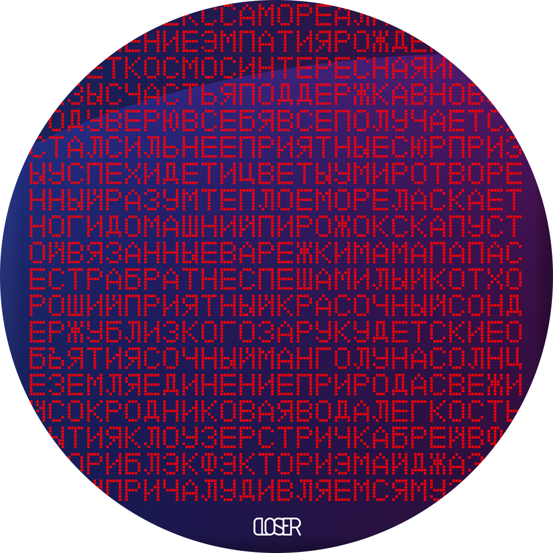
To the left of the total sum of monies raised displayed in bold for all to feel proud of, an image caught my eye. It was a continuous scrolling line of Cyrillic script comprised of red dots made to represent LED lights printed on a nocturnal blue and purple-backed poster, reminding me of passenger information notices onboard the buses and trains I once took on my daily commute across South London. Mesmerised by the creative piece of design, I quickly looked up the message behind it. For the new year, Closer have decided to display an endless running message of good wishes and positive news. They will be installing scrolling LED screens on the dance floor, and feed them a continuous flow of uplifting text for us all to read and quietly smile at as we dance into the night.
This got me thinking of all those memorable posters and flyers designed to show off lineups and monthly events in fun and creative, eye-catching ways. I can vividly remember visiting my mates in Leeds to find their living room walls plastered in posters of Mint Club’s Technicolor monthly lineups in chronological order. Sadly, I can’t seem to find these personal memorabilia online, but fortunately the memory continues to stick with me all these years. While posters and flyers don’t technically contribute to the musical side of an event, they can clearly play their part in representing the look and feel of the event - and if well designed, even become objects of reminiscence when it’s not so easy to remember the actual nights themselves. A lot of work goes into designing club-related artwork, and with good reason. After all, no one’s going to get sentimental over a paragraph of black Helvetica on a white A4 page, no matter how carefully thought up and put together the lineup is.
Whether it’s the bold and imaginative use of Radja Nainggolan, a distinguishable Belgian footballer pasted onto a dark chocolate Bounty wrapper to promote the semi-frequent Trance Party series at Corsica Studios, or a more vague and ambiguous, text-heavy style of poster like Closer’s LED-filled image, artwork that resonates with us tends to stay with us far beyond the night itself. While my mind’s fixated on getting back into the clubs, the pent-up creative juices that’ll be flung onto this year’s posters and flyers are going to be gold, and most definitely living room wall-worthy. So get yourself some Blu Tack and make some space; it won’t be long now.